

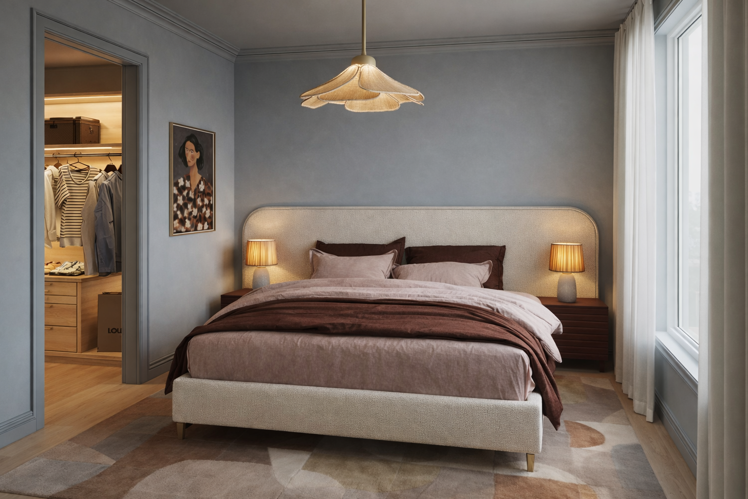
If you’re trying to work out how to choose paint colours for your home, it can feel overwhelming. There are hundreds of thousands of colours available, and standing in front of thousands of tiny paint chips can make even someone who loves colour suddenly think, maybe I’ll just paint it white.
But choosing the right paint colour isn’t simply about finding a colour you like. It’s understanding what that colour is going to do in your home.
The natural light, orientation, flooring, cabinetry, furniture and the colours surrounding it can all change the way you see a paint colour. Something that looked incredible in a friend’s house, on Pinterest or in the paint shop might look completely different once you bring it home.
The paint hasn’t changed. The environment around it has.
At Nikki Weedon Interiors, colour isn’t something we add at the end. It’s part of the design direction from the beginning, alongside materials, finishes, furniture, lighting and artwork. If you’re planning a renovation or decoration project, our interior design services bring all of those decisions together rather than selecting each one in isolation.
Start with how you want your home to feel
Before you start looking at paint colours, I want you to think about how you want the room to feel.
Do you want your bedroom to feel cocooning at night?
Do you want your kitchen to feel energetic in the morning?
Do you want your living room to feel warm and inviting when friends come over?
This is where colour psychology becomes really interesting.
But I don’t believe it’s as simple as blue equals calm and yellow equals happy. Our response to colour can be incredibly personal. A colour might remind you of somewhere you’ve travelled, a childhood home, something you wear constantly or simply make you feel good when you’re surrounded by it.
That’s the information I’m interested in when selecting colours for a client. We’re not just asking, what colour do you like? We’re asking, how do you want your home to feel?
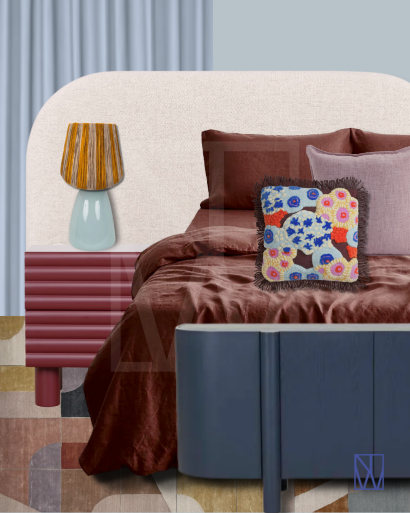
Light changes everything
Here in Melbourne, the orientation of your home has a huge influence on how paint colours behave.
North facing rooms generally receive more consistent natural light, while south facing rooms receive cooler, less direct light. East facing rooms can glow in the morning and become much cooler later in the day, while west facing rooms can receive strong afternoon sun.
But your room’s orientation doesn’t give us a prescribed list of colours we’re allowed to use. It simply gives us more information.
I’ll be writing more about this in my guide to choosing the best paint colours, because there’s a lot of colour advice online that comes from the Northern Hemisphere and doesn’t necessarily apply to our Melbourne homes.
And please don’t automatically reach for white because your room is dark.
As I’ve talked about before, white doesn’t automatically make a room look bigger. White can reflect the light that’s available. It can’t create sunlight that isn’t there.
Sometimes the answer isn’t trying to make a darker room feel brighter. Sometimes we need to stop fighting it and work with what the room naturally does well.
Colour doesn’t have to stop at the walls
Your walls aren’t the only place we can use colour. Ceilings, cornices, skirting boards, architraves, doors and joinery are all part of the colour story too.
We’ve become so used to automatically painting ceilings and woodwork white that we don’t necessarily think of it as a design decision anymore. But it is. Sometimes I’ll carry the wall colour across the skirting, architraves and even the ceiling. In another home, we might use a contrasting colour. It depends on the room and the bigger design direction.
And there’s a term you’re going to hear a lot more of: colour drenching.
Colour drenching takes one colour or closely related tones, across multiple surfaces in a room rather than automatically breaking everything up with white. Walls, ceilings, doors and woodwork can all become part of the same colour story.
It doesn’t mean every room needs to be drenched in colour. But it does mean we can stop treating white ceilings and trims as the default.
The important thing is that we’re looking at the whole room, rather than choosing one wall colour and treating everything else as an afterthought.
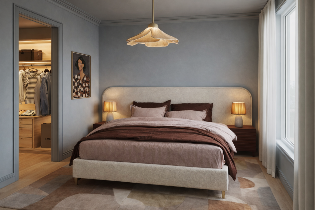
Test your paint colours properly
This is the part I don’t want you to skip. A tiny paint chip isn’t enough.
If you can order an A4 paint sample, start there. At Nikki Weedon Interiors, we provide our clients with large paint samples because I want them to see what the colour actually does in their home before committing to it.
Move the sample around the room and put it against every wall. The exact same colour can look warmer on one wall, cooler on another and much deeper in a darker corner. Then look at it morning, noon and night. Look at it in the morning light. Come back at midday. Then look again at night when the natural light has disappeared and your lamps and overhead lighting are on.
You’re going to live with that colour at all of those times, so don’t make the decision based on how it looked for 5 minutes at 11am.
And if you’re buying a sample pot, paint a big swatch. Not a tiny square directly onto the wall. Paint a large piece of white card or A1, A2 or A3 paper and leave some white around the outside. Once it’s dry, you can move it around the room and see how it responds to different walls and different light. Live with it for a few days before making the decision.
My 5 steps for choosing paint colours
- Start with the feeling – How do you want the room to feel?
- Understand your light – Check the orientation and watch how the light changes throughout the day.
- Look at the whole room – Flooring, cabinetry, stone, furniture and adjoining colours all influence what you’re seeing.
- Use large samples – Move them around every wall and look at them morning, noon and night.
- Paint a big swatch – If you’re using a sample pot, paint onto a large piece of white card or A3 paper rather than making a tiny patch on the wall.
Choosing paint colours isn’t about finding the perfect colour online. It’s about understanding why a colour works in your home.
Take your time. Test it properly. Look at it morning, noon and night. And don’t be afraid of choosing something simply because it’s more colourful than what you’re used to seeing.
If you’d like to see how we use colour across real homes, explore our Melbourne interior design projects.
If you’re renovating or decorating and want more colour in your Melbourne home but don’t know how to bring it all together, get in touch and tell us about your project.

